Maple is a leading Canadian telemedicine provider that allows patients to connect online with a wide range of healthcare professionals. Our relationship began in late 2015 with a ground-up identity design engagement.
The compelling nature of Maple’s value proposition encouraged the generation of a welcoming and memorable art direction. In the years since 2015, our studio has contributed to major iterations of the web presence, digital product design, social media templates, and a host of other deliverables that continue to enhance the company’s marketing, sales, and user experience metrics. Maple was recently backed by a $75 million investment by Shoppers Drug Mart.


“Studio Function has played a central role in the development of our brand identity over multiple periods of growth. From the generation of Maple’s initial identity assets, to the recent evolution of our visual language, Frank and Vivian have provided outstanding guidance and design execution.
Their vision has been consistently ahead of the market, and their project implementation always impeccably timely and organized. A true pleasure to work with.”

Dr. Brett Belchetz
Co-founder & CEO
Maple


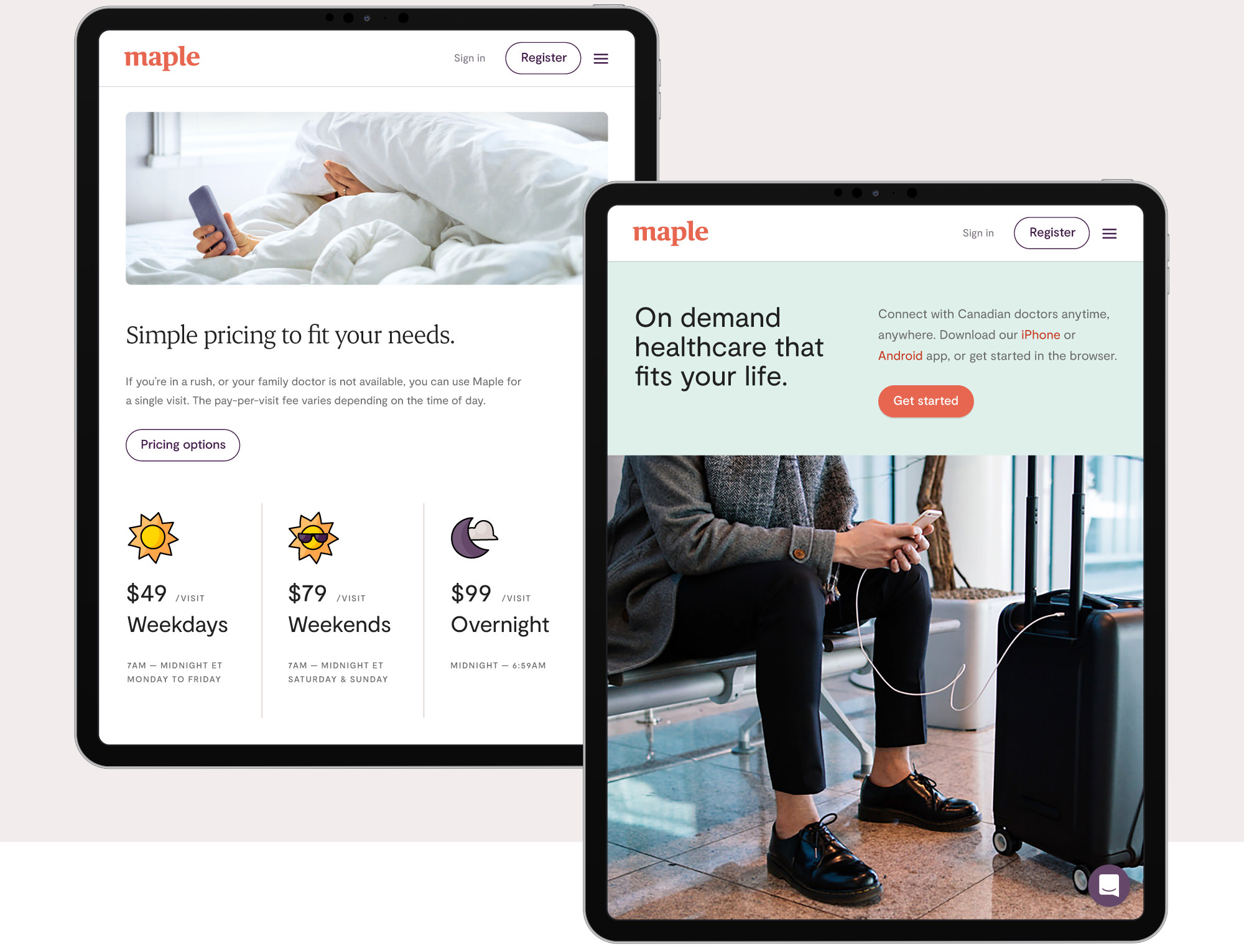
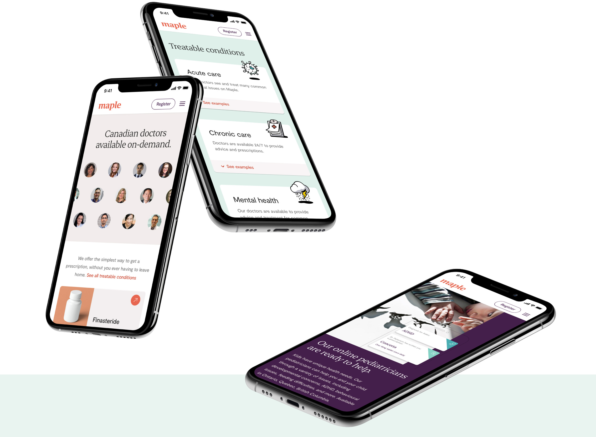
Maple’s D2C marketing touchpoints have the challenge of introducing an emerging service to Canadian users who are not accustomed to paying for doctor consultations.
The identity system we produced anticipates this friction and embraces the opportunity to change audience perception and behaviours. D2C collateral emphasizes the personal benefits of Maple’s convenient, patient-centric service to immediately convey value and drive conversions.


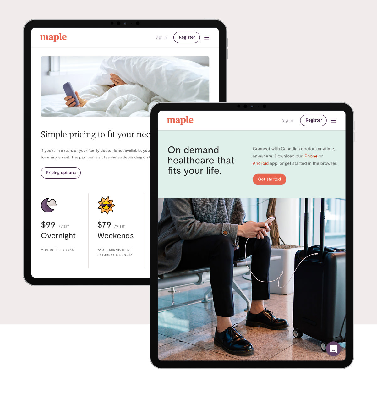
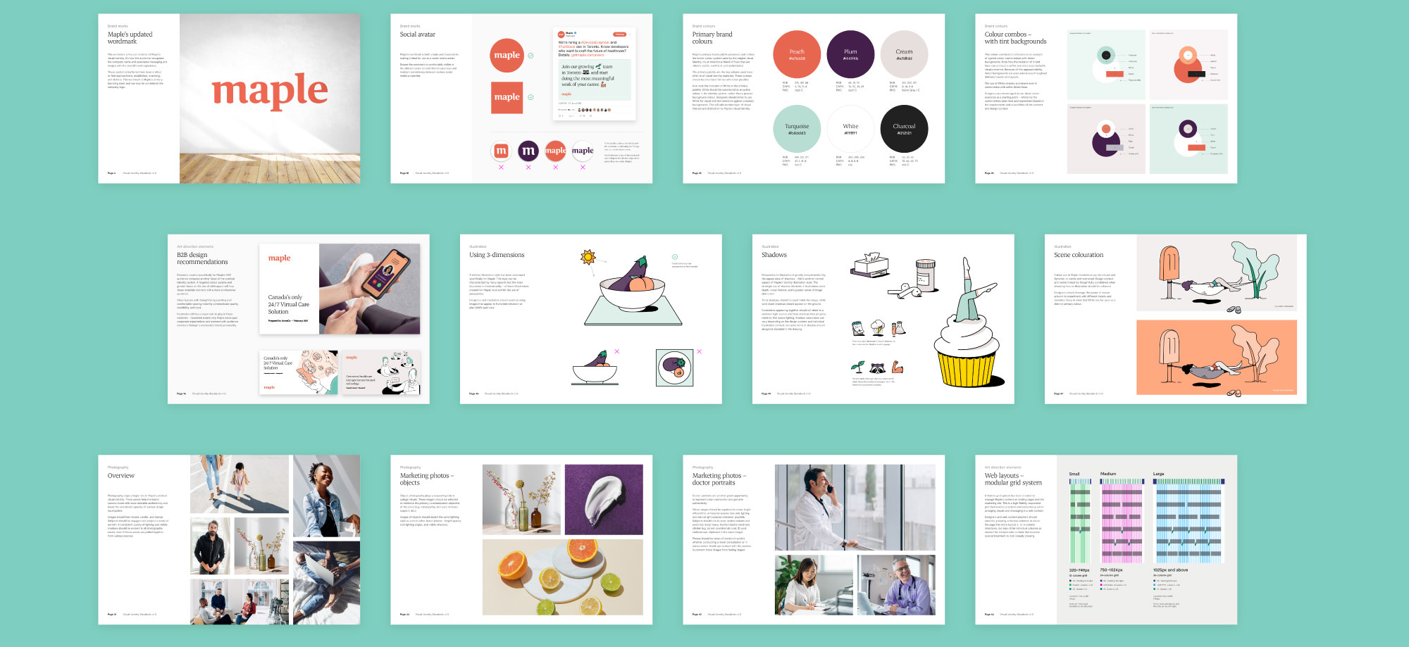
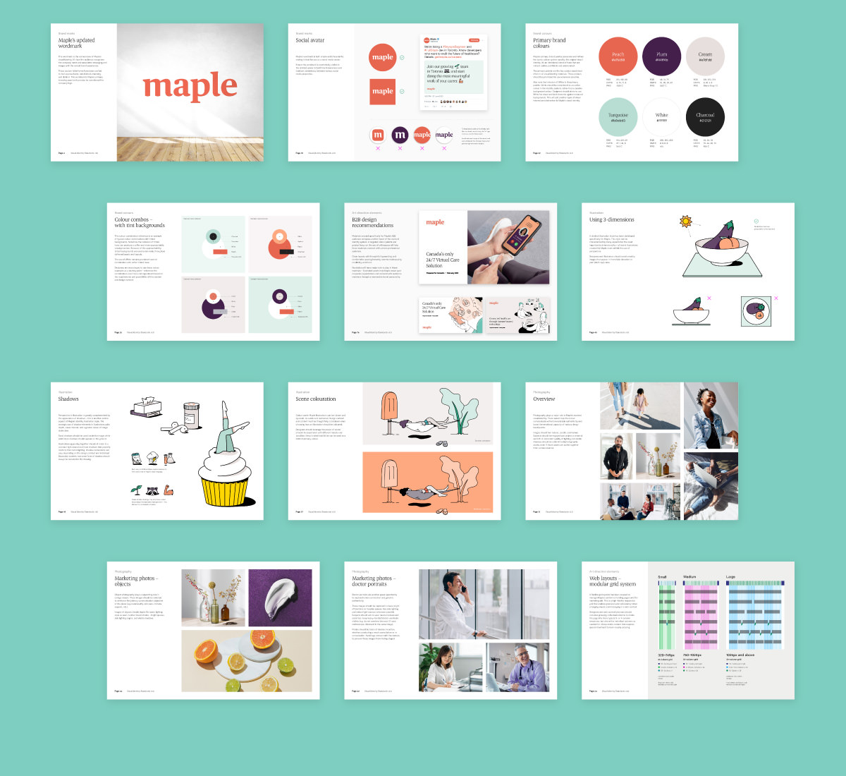
Various expressions of Maple’s identity blend custom illustrations, authentic photography, and charming copywriting to comfort users and differentiate Maple from the competitive landscape. This dynamic system provides the flexibility to curate messages based on design context and target audience.
Our thoughtful identity system also provides a benchmark to ensure visual quality and consistency are maintained as new collateral is produced by Maple’s internal design staff.

 Studio Function